-
Hello!
Either you have not registered on this site yet, or you are registered but have not logged in. In either case, you will not be able to use the full functionality of this site until you have registered, and then logged in after your registration has been approved.
Registration is FREE, so please register so you can participate instead of remaining a lurker....
Please be certain that the location field is correctly filled out when you register. All registrations that appear to be bogus will be rejected. Which means that if your location field does NOT match the actual location of your registration IP address, then your registration will be rejected.
Sorry about the strictness of this requirement, but it is necessary to block spammers and scammers at the door as much as possible.
You are using an out of date browser. It may not display this or other websites correctly.
You should upgrade or use an alternative browser.
You should upgrade or use an alternative browser.
I need some opinions here!!!
- Thread starter CULEBRA85
- Start date
headly1994
New member
lol i dnt know much about buisness but that logo is awesome id get it tatood on me with some color
CULEBRA85
JUST ANOTHER JOSH!!! LOL
thanx...i plan on adding color to the end product.lol i dnt know much about buisness but that logo is awesome id get it tatood on me with some color
ShenziSixaxis
Sticking To The Ceiling
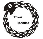
Pretty cool, though the text is a bit too simple, and it looks like the cannibalistic corn Kathy has.
Karoni
Cornaholic
I love the snake in your logo! Very visually interesting. I agree that the font is too plain. I also agree about adding the entire business name to the logo. This may just be me--I'm really into symmetry--but the alignment of the words bugs me. I keep wanting to center them, but that might be boring.
OkeeteeMom
Lovin' My Snakes!
Along with others, I agree that the full name should be in print. Along with a really, really cool font. AND...if you need help with a website, let me know. That's what I do.
CULEBRA85
JUST ANOTHER JOSH!!! LOL
Well its just a rough draft i have a friend that does graphic design and hes gonna help me clean it up.Pretty cool, though the text is a bit too simple, and it looks like the cannibalistic corn Kathy has.
Thats wat i was thinking nanci.I think I would have the whole name, O-Town Reptiles, inside. Not assume everyone knows the snake is an O. Also- a more interesting font.
the misaligned letters bother me 2 but i think it gets pplz attention.I love the snake in your logo! Very visually interesting. I agree that the font is too plain. I also agree about adding the entire business name to the logo. This may just be me--I'm really into symmetry--but the alignment of the words bugs me. I keep wanting to center them, but that might be boring.
Cool font coming soon!!! lol ill keep the website offer in mind...Gracias!!:cheers:Along with others, I agree that the full name should be in print. Along with a really, really cool font. AND...if you need help with a website, let me know. That's what I do.