• Hello!

    Either you have not registered on this site yet, or you are registered but have not logged in. In either case, you will not be able to use the full functionality of this site until you have registered, and then logged in after your registration has been approved.

    Registration is FREE, so please register so you can participate instead of remaining a lurker....

    Please be certain that the location field is correctly filled out when you register. All registrations that appear to be bogus will be rejected. Which means that if your location field does NOT match the actual location of your registration IP address, then your registration will be rejected.

    Sorry about the strictness of this requirement, but it is necessary to block spammers and scammers at the door as much as possible.

Snake Queen Entry 1 DRAFT

Snake Queen

rakes snock!
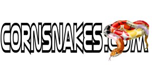
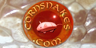
I was thinking about not posting this preliminary sketch, but since rich said that we can post more and refine them, I am posting it. This is a VERY rough sketch.... I plan on drawing all the scales etc.

I was going for the idea to show most of the colors that there are in a cornsnake. I will decide if I like it once i am done. I will also do a solid color, and see which I like better. I still dont know what color to make the letters. Oh well, tell me what you think!
 

Attachments

  • cornsnakelogo copy.jpg
    cornsnakelogo copy.jpg
    51.6 KB · Views: 126
It's cute but it's kind of hard to see the COM b/c the snake is covering it.
Also, what do you think of making the snake one specific morph? Maybe a Lavender or something Rich specializes in? The multi-morph idea is good, but it's kind of...distracting. I don't know quite how to word what I mean...but I think a pretty Lav or Fluorescent Orange would be effective.
 
Yes, I was beginning to not like the multimorph thing myself. I will probably do it as a snow or normal or lavender. Thanks for the advice!

Oh, about the com.... do you really think it is necessary to show it more? I dont think so, but my family says i should.
 
Personaly, i dont think you need to show it all, but if i were you, i would probably show the majority of it. If you are going to place the snake over a bit of the writing, make sure we can see the top of the "com", bit, , , i think it will look really effective.

BTW, i LOVE this entry, its one of my faveourites, so keep workin on it as if its only a draft, i cant wait to see the finished product!!!

Kris
 
Be sure that after you're done you crop it down to 320x160 pixels, kinda the size of the opal picture up top. But besides that, good job so far.
 
Back
Top