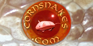
I love it, but have 2 suggestions. One is: slow down the animation. I hate animation for logos because they can be too distracting-- but I think your design is really nice, so it doesn't bother me too much. If you slowed down the animation it would be even better in my opinion. On a site like this where you will most likely be on a page for a while looking thru topics, quick flashing of animation is distracting, especially to regular visitors. My second suggestion is a non-white background. If I were you I'd play around and see what else looks good, just to make the snakes pop out a bit more. This is one of my top three favorites-- at least-- in the contest, so good luck!!!

